Chapter 4 Differential Abundance Analysis
This chapter focuses on differential abundance analysis for cross-sectional studies, identifying proteins that differ significantly between groups using linear models. For studies with repeated measures for the same individual, see Chapter 5: Longitudinal Analysis.
Note on terminology: We use “differential abundance” rather than “differential expression” because NULISAseq measures protein levels directly, not gene expression (mRNA). While “differential expression” is sometimes used colloquially in proteomics, “differential abundance” is the more technically accurate term for protein-level measurements.
4.1 Overview
Differential abundance analysis answers the question: “Which protein abundance levels are significantly different between conditions?”
The lmNULISAseq() function:
- Fits a linear model for each protein, with protein abundance (NPQ) as the dependent variable
- Tests associations between protein levels and your primary variables of interest (e.g., Disease vs. Control)
- Adjusts for covariates (e.g., age and sex), ensuring that differences are attributed by the effect of interest
- Corrects for multiple testing (Benjamini-Hochberg (BH) false discovery rate (FDR) or Bonferroni correction)
See complete function documentation and additional options, use ?lmNULISAseq().
4.2 Differential Abundance
4.2.1 Group Comparison
The most basic analysis compares two groups:
#> [1] "factor"#> [1] "normal" "inflam" "cancer" "kidney" "metab" "neuro"# Set levels if needed, first group is reference level
levels(metadata$disease_type) <- c("normal", "inflam", "cancer", "kidney", "metab", "neuro")
# Compare disease vs normal (adjusting for sex and age)
lmTest <- lmNULISAseq(
data = data$merged$Data_NPQ[, sample_list],
sampleInfo = metadata %>% filter(SampleName %in% sample_list),
sampleName_var = "SampleName",
modelFormula = "disease_type + sex + age"
)4.3 Model Results
The function returns a list with:
#> [1] "modelStats"#> Preview of `lmTest$modelStats` Results Table (rounded to 3 digits):4.3.1 Key Columns in Results
For each comparison (e.g., “disease_typeinflam” vs reference “normal”):
disease_typeinflam_coef: Effect size (log fold-change)disease_typeinflam_pval: Raw p-valuedisease_typeinflam_pval_FDR: FDR-adjusted p-valuedisease_typeinflam_pval_bonf: Bonferroni-adjusted p-valuetarget: Target name
4.4 Finding Significant Proteins
Focusing on the comparison between Inflammatory Disease vs Normal, adjusting for age and sex, we will identify proteins that are significantly differentially abundant with FDR-adjusted p value < 0.05 and a log2 fold-change threshold of at least ± 0.5.
4.4.1 Filter by FDR Threshold
# Define significance threshold
fdr_threshold <- 0.05
fc_threshold <- 0.5  # Fold-change threshold (log2 scale)

# Find significant proteins for Inflammatory Disease vs Normal
sig_inflam <- lmTest$modelStats %>%
  filter(
    disease_typeinflam_pval_FDR < fdr_threshold,
    abs(disease_typeinflam_coef) > fc_threshold
  ) %>%
  arrange(disease_typeinflam_pval_FDR)
#> Significant proteins (Inflammatory Disease vs Normal): 914.4.2 Higher vs Lower Abundance
We can further identify significant differentially abundant proteins that are either higher or lower in the inflammatory disease group compared to normal group.
# Higher in inflammatory disease
higher <- sig_inflam %>%
  filter(disease_typeinflam_coef > 0) %>%
  arrange(desc(disease_typeinflam_coef))

# Lower in inflammatory disease
lower <- sig_inflam %>%
  filter(disease_typeinflam_coef < 0) %>%
  arrange(disease_typeinflam_coef)

cat("Higher abundance in inflammatory disease:", nrow(higher), "\n")
#> Higher abundance in inflammatory disease: 91#> Lower abundance in inflammatory disease: 04.5 Volcano Plots
Volcano plots visualize differential abundance results effectively. To see complete function documentation and additional options, use ?volcanoPlot().
4.5.1 Inflammatory Disease vs Normal
volcanoPlot(
  coefs = lmTest$modelStats$disease_typeinflam_coef,
  p_vals = lmTest$modelStats$disease_typeinflam_pval_FDR,
  target_labels = lmTest$modelStats$target,
  title = "Inflammatory Disease vs Normal"
)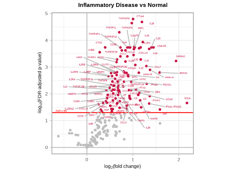
4.5.2 Understanding Volcano Plots
- X-axis: Effect size (log2 fold-change)
- Y-axis: Statistical significance (-log10 p-value)
- Significant targets: Points in upper left/right corners
- Higher-abundance targets: Right side / Red (positive log2 fold-change)
- Lower-abundance targets: Left side / Blue (negative log2 fold-change)
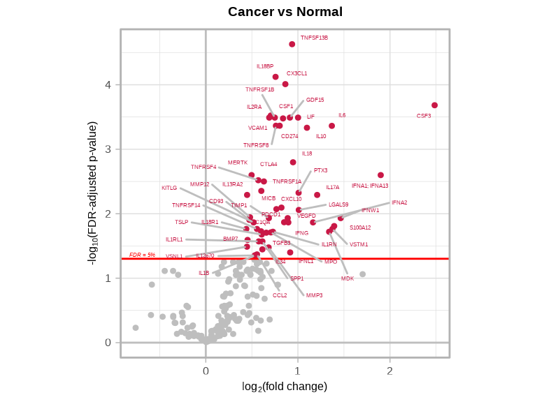
4.5.3 Cancer vs Normal
volcanoPlot(
  coefs = lmTest$modelStats$disease_typecancer_coef,
  p_vals = lmTest$modelStats$disease_typecancer_pval_FDR,
  target_labels = lmTest$modelStats$target,
  title = "Cancer vs Normal"
)
4.5.4 Saving Volcano Plots
# Automatically saves to file
volcanoPlot(
  coefs = lmTest$modelStats$disease_typeinflam_coef,
  p_vals = lmTest$modelStats$disease_typeinflam_pval_FDR,
  target_labels = lmTest$modelStats$target,
  title = "Cancer vs Normal",
  plot_name = "figures/FDR_volcano_plot_inflam_vs_normal.pdf",     # Filename (PDF, PNG, JPG, SVG)
  data_dir = "figures",                                            # Where to save
  plot_width = 5,                                                  # Width in inches
  plot_height = 5                                                  # Height in inches
)

volcanoPlot(
  coefs = lmTest$modelStats$disease_typecancer_coef,
  p_vals = lmTest$modelStats$disease_typecancer_pval_FDR,
  target_labels = lmTest$modelStats$target,
  title = "Cancer vs Normal",
  plot_name = "figures/FDR_volcano_plot_cancer_vs_normal.pdf",     # Filename (PDF, PNG, JPG, SVG)
  data_dir = "figures",                                            # Where to save
  plot_width = 5,                                                  # Width in inches
  plot_height = 5                                                  # Height in inches
)
4.6 Visualization of Significant Targets
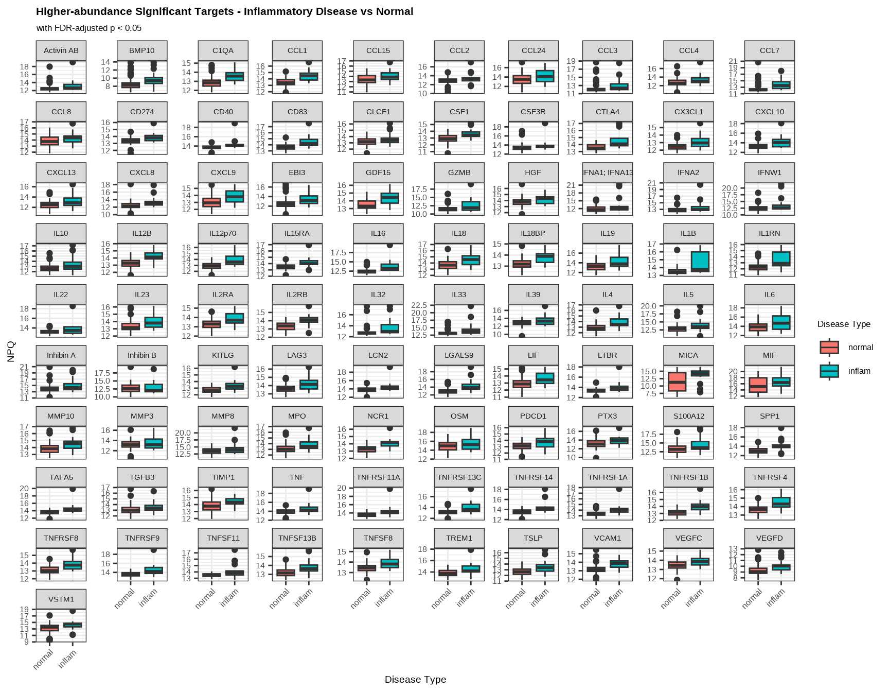
Visualize the proteins that show significant difference in abundance between Inflammatory Disease and Normal samples.
4.6.1 Inflammatory Disease vs Normal
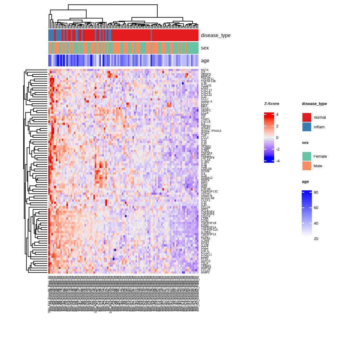
Heatmap
The heatmap shows abundance patterns of higher abundance proteins in Inflammatory Disease versus Normal samples. Samples with similar abundance profiles cluster together with unsupervised clustering.
inflam_samples <- metadata %>%
  filter(disease_type %in% c("normal", "inflam")) %>%
  pull(SampleName)

heatmap_inflam <- generate_heatmap(
  data = data$merged$Data_NPQ,
  sampleInfo = metadata,
  sampleName_var = "SampleName",
  sample_subset = inflam_samples,
  target_subset = higher$target,
  row_fontsize = 7,
  col_fontsize = 7,
  annotate_sample_by = c("disease_type", "sex", "age")
)
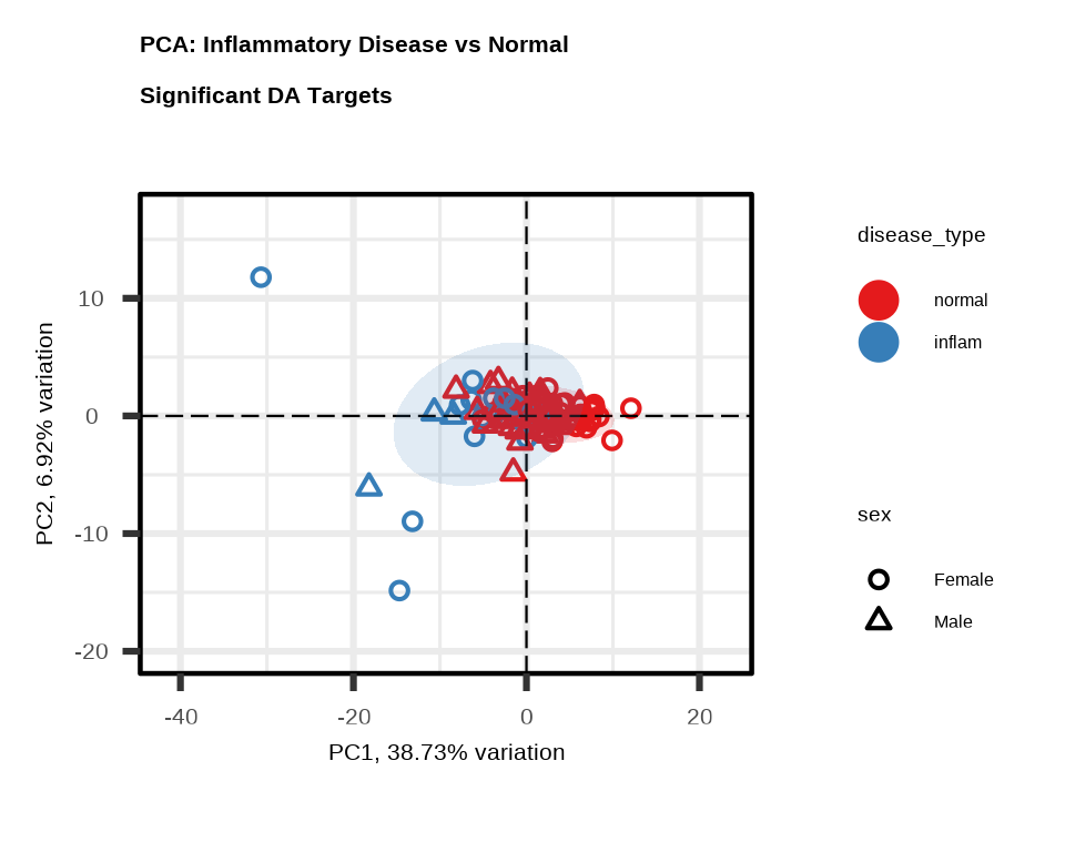
PCA
PCA shows how well the significant proteins separate Inflammatory Disease from Normal samples. Each point represents one sample.
pca_inflam <- generate_pca(
  data = data$merged$Data_NPQ,
  plot_title = "PCA: Inflammatory Disease vs Normal \nSignificant DA Targets",
  sampleInfo = metadata,
  sampleName_var = "SampleName",
  sample_subset = inflam_samples,
  target_subset = higher$target,
  annotate_sample_by = "disease_type",
  shape_by = "sex"
)
Boxplot: Higher-abundance Targets
Boxplots show the abundance distribution of each higher abundance protein in Inflammatory Disease versus Normal samples. Higher mean NPQ in Inflammatory Disease samples confirms higher abundance.
data_long %>%
  filter(Target %in% higher$target,
         SampleName %in% inflam_samples) %>%
  ggplot(aes(x = disease_type, y = NPQ, fill = disease_type)) +
  geom_boxplot() +
  facet_wrap(~ Target, scales = "free_y") +
  labs(title = "Higher-abundance Significant Targets - Inflammatory Disease vs Normal",
       subtitle = "with FDR-adjusted p < 0.05",
       x = "Disease Type", y = "NPQ", fill = "Disease Type") +
  theme(
    plot.title = element_text(size = 16, face = "bold"),
    plot.subtitle = element_text(size = 13),
    axis.title.x = element_text(size = 14),
    axis.title.y = element_text(size = 14),
    axis.text.x = element_text(size = 12, angle = 45, hjust = 1),
    axis.text.y = element_text(size = 12),
    strip.text = element_text(size = 11),
    legend.title = element_text(size = 13),
    legend.text = element_text(size = 12)
  )
4.7 Multiple Disease Groups
When you have multiple disease categories, you get results for the comparison of each disease group versus normal:
# All disease groups vs "normal" (reference level)
groups <- c("inflam", "cancer", "kidney", "metab", "neuro")

for (group in groups) {
  coef_col <- paste0("disease_type", group, "_coef")
  pval_col <- paste0("disease_type", group, "_pval_FDR")

  if (coef_col %in% colnames(lmTest$modelStats)) {
    n_sig <- sum(lmTest$modelStats[[pval_col]] < 0.05, na.rm = TRUE)
    cat(group, "vs normal:", n_sig, "significant proteins\n")
  }
}
#> inflam vs normal: 104 significant proteins
#> cancer vs normal: 55 significant proteins
#> kidney vs normal: 150 significant proteins
#> metab vs normal: 1 significant proteins
#> neuro vs normal: 0 significant proteins4.8 Model Considerations
4.8.2 Including Covariates
Always adjust for relevant covariates:
# Include covariates that might confound results
lmTest <- lmNULISAseq(
  data = data$merged$Data_NPQ[, sample_list],
  sampleInfo = metadata %>% filter(SampleName %in% sample_list),
  sampleName_var = "SampleName",
  modelFormula = "disease_type + sex + age + PlateID"  # Added plate ID
)
Common covariates:
- Technical: Batch, plate, run date
- Biological: Age, sex, BMI
- Clinical: Disease stage, treatment status
4.8.3 Model Formula Options
# Simple comparison (no covariates)
modelFormula = "disease_type"

# With covariates
modelFormula = "disease_type + sex + age"

# With interactions
modelFormula = "disease_type * sex + age"  # Interaction term tests if disease effect differs by sex

# Continuous predictor
modelFormula = "age + sex"  # Tests association with age
4.9 Interpreting Results
4.9.1 Effect Size (Coefficient)
- Positive coefficient: Protein is higher in test group vs reference
- Negative coefficient: Protein is lower in test group vs reference
- Magnitude: Larger value = bigger difference between groups
- Units are log2(fold change)
- Convert to fold change by calculating \(\text{fold change} = 2^{\text{coefficient}}\)
4.9.2 P-values
- Raw p-value: Probability of the observed or more extreme difference under the null hypothesis
- FDR-adjusted p-value: Accounts for multiple testing across targets by Benjamini-Hochberg (BH) false discovery rate (FDR)
- Bonferroni-adjusted p-value: Accounts for multiple testing across by Bonferroni correction
4.10 Exporting Results
4.10.2 Create Summary Table
# Count significant proteins per disease group comparison
summary_table <- data.frame(
  Disease_group = character(),
  Significant_Proteins = integer(),
  Higher_abundance = integer(),
  Lower_abundance = integer()
)

for (group in groups) {
  coef_col <- paste0("disease_type", group, "_coef")
  pval_col <- paste0("disease_type", group, "_pval_FDR")

  if (coef_col %in% colnames(lmTest$modelStats)) {
    sig <- lmTest$modelStats %>%
      filter(.data[[pval_col]] < 0.05)

    summary_table <- rbind(summary_table, data.frame(
      Disease_group = paste(group, "vs normal"),
      Significant_Proteins = nrow(sig),
      Higher_abundance = sum(sig[[coef_col]] > 0),
      Lower_abundance = sum(sig[[coef_col]] < 0)
    ))
  }
}| Disease_group | Significant_Proteins | Higher_abundance | Lower_abundance |
|---|---|---|---|
| inflam vs normal | 104 | 104 | 0 |
| cancer vs normal | 55 | 55 | 0 |
| kidney vs normal | 150 | 150 | 0 |
| metab vs normal | 1 | 1 | 0 |
| neuro vs normal | 0 | 0 | 0 |
4.11 Complete Differential Abundance Workflow
# Load libraries
library(NULISAseqR)
library(tidyverse)

# Set up output directory
out_dir <- "figures"
dir.create(out_dir, showWarnings = FALSE)

# 1. Run differential abundance
lmTest <- lmNULISAseq(
  data = data$merged$Data_NPQ[, sample_list],
  sampleInfo = metadata %>% filter(SampleName %in% sample_list),
  sampleName_var = "SampleName",
  modelFormula = "disease_type + sex + age"
)

# 2. Filter significant results
# Define significance threshold
fdr_threshold <- 0.05
fc_threshold <- 0.5  # Fold-change threshold (log2 scale)

sig_inflam <- lmTest$modelStats %>%
  filter(
    disease_typeinflam_pval_FDR < fdr_threshold,
    abs(disease_typeinflam_coef) > fc_threshold
  ) %>%
  arrange(disease_typeinflam_pval_FDR)

sig_cancer <- lmTest$modelStats %>%
  filter(
    disease_typecancer_pval_FDR < fdr_threshold,
    abs(disease_typecancer_coef) > fc_threshold
  ) %>%
  arrange(disease_typecancer_pval_FDR)

# Higher-abundance in inflammatory disease
higher <- sig_inflam %>%
  filter(disease_typeinflam_coef > 0) %>%
  arrange(desc(disease_typeinflam_coef))

# Lower-abundance in inflammatory disease
lower <- sig_inflam %>%
  filter(disease_typeinflam_coef < 0) %>%
  arrange(disease_typeinflam_coef)

# 3. Create volcano plots and save as PDF
volcanoPlot(
  coefs = lmTest$modelStats$disease_typeinflam_coef,
  p_vals = lmTest$modelStats$disease_typeinflam_pval_FDR,
  target_labels = lmTest$modelStats$target,
  title = "Cancer vs Normal",
  plot_name = "FDR_volcano_plot_inflam_vs_normal.pdf",
  output_dir = out_dir,
  plot_width = 5,
  plot_height = 5
)

volcanoPlot(
  coefs = lmTest$modelStats$disease_typecancer_coef,
  p_vals = lmTest$modelStats$disease_typecancer_pval_FDR,
  target_labels = lmTest$modelStats$target,
  title = "Cancer vs Normal",
  plot_name = "FDR_volcano_plot_cancer_vs_normal.pdf",
  output_dir = out_dir,
  plot_width = 5,
  plot_height = 5
)

# 4. Create heatmap and PCA of significant targets and save as PDF
## Get inflammatory disease and normal sample name
inflam_samples <- metadata %>%
  filter(disease_type %in% c("normal", "inflam")) %>%
  pull(SampleName)

## Generate heatmap with annotations
heatmap_inflam <- generate_heatmap(
  data = data$merged$Data_NPQ,
  sampleInfo = metadata,
  sampleName_var = "SampleName",
  sample_subset = inflam_samples,
  target_subset = higher$target,
  annotate_sample_by = c("disease_type", "sex", "age"),
  output_dir = "figures",
  plot_name = "FDR_heatmap_inflam_vs_normal.pdf",
  plot_width = 8,
  plot_height = 6
)

## Generate PCA plot
pca_inflam <- generate_pca(
  data = data$merged$Data_NPQ,
  plot_title = "PCA: Inflammatory Disease vs Normal \nSignificant DA Targets",
  sampleInfo = metadata,
  sampleName_var = "SampleName",
  sample_subset = inflam_samples,
  target_subset = higher$target,
  annotate_sample_by = "disease_type",
  shape_by = "sex",
  output_dir = "figures",
  plot_name = "FDR_pca_plot_inflam_vs_normal.pdf",
  plot_width = 5,
  plot_height = 4
)

# 5. Create boxplot of significant targets and save as PDF
boxplot <- data_long %>%
  filter(Target %in% higher$target,
         SampleName %in% inflam_samples) %>%
  ggplot(aes(x = disease_type, y = NPQ, fill = disease_type)) +
  geom_boxplot() +
  facet_wrap(~ Target, scales = "free_y") +
  labs(title = "Higher-abundance Significant Differential Abundance Targets - Inflammatory Disease vs Normal",
       subtitle = "with FDR-adjusted p < 0.05",
       x = "Disease Type", y = "NPQ", legend = "Disease Type") +
  theme(strip.text = element_text(size = 8.5),
        axis.text.x = element_text(angle = 45, hjust = 1))

print(boxplot)

ggsave(filename = "FDR_boxplot_inflam_vs_normal.pdf", plot = boxplot, path = "figures", width = 12, height = 9)

# 6. Export results
dir.create("results", showWarnings = FALSE)
write_csv(lmTest$modelStats, "results/all_DA_results.csv")
write_csv(sig_inflam, "results/sig_inflam_proteins.csv")
write_csv(sig_cancer, "results/sig_cancer_proteins.csv")

# 7. Print summary
cat("\nDifferential Abundance Summary:\n")
cat("Inflammatory Disease vs Normal:", nrow(sig_inflam), "significant proteins\n")
cat("Cancer vs Normal:", nrow(sig_cancer), "significant proteins\n")
4.12 Best Practices
Model Design
- Include relevant covariates to adjust for confounding and account for known sources of variation (e.g., age, sex)
- Use appropriate reference levels
- Consider batch effects
Interpretation
- Using FDR-adjusted p-values for significance, accounting for multiple testing
- Consider both statistical significance AND effect size
- Confirm key findings using visualization
Reporting
- Document model formula used
- Report both FDR thresholds and any fold-change cutoffs applied
- Include sample sizes per group
4.13 Common Issues
Problem: No significant proteins
- Check if groups are truly different (check sample label and metadata accuracy, explore heatmaps and PCA)
- Sample size might be too small
- Effect sizes might be small
- Try less stringent FDR threshold or use unadjusted p-values (exploratory only)
Problem: Everything is significant
- Check for batch effects
- Verify model is appropriate
- Consider more stringent thresholds
Problem: Results don’t match biology
- Check factor levels and reference group
- Verify metadata is correct
- Consider additional covariates
Continue to: Chapter 5: Longitudinal Analysis